LaLiga
Graphic Identities
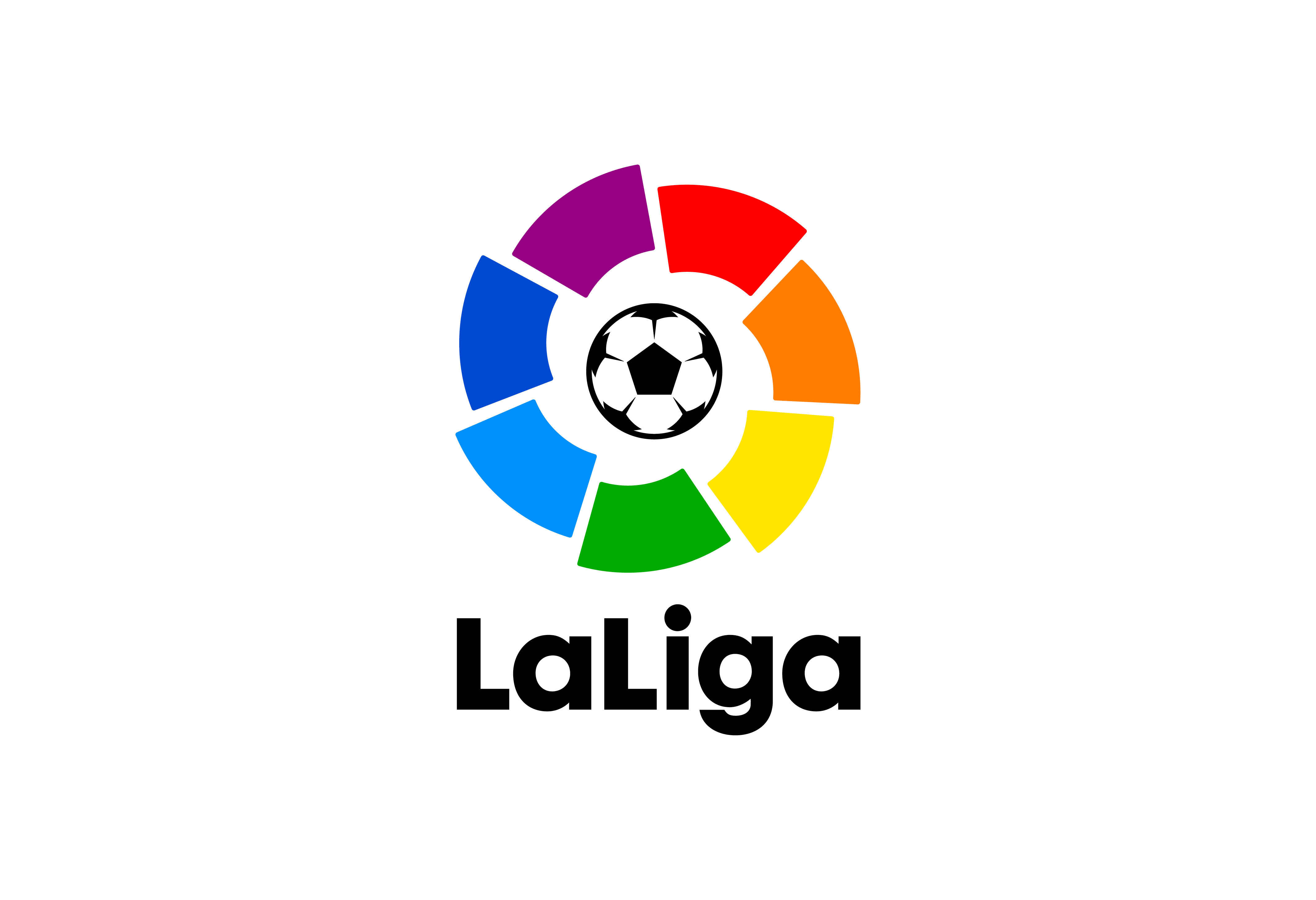
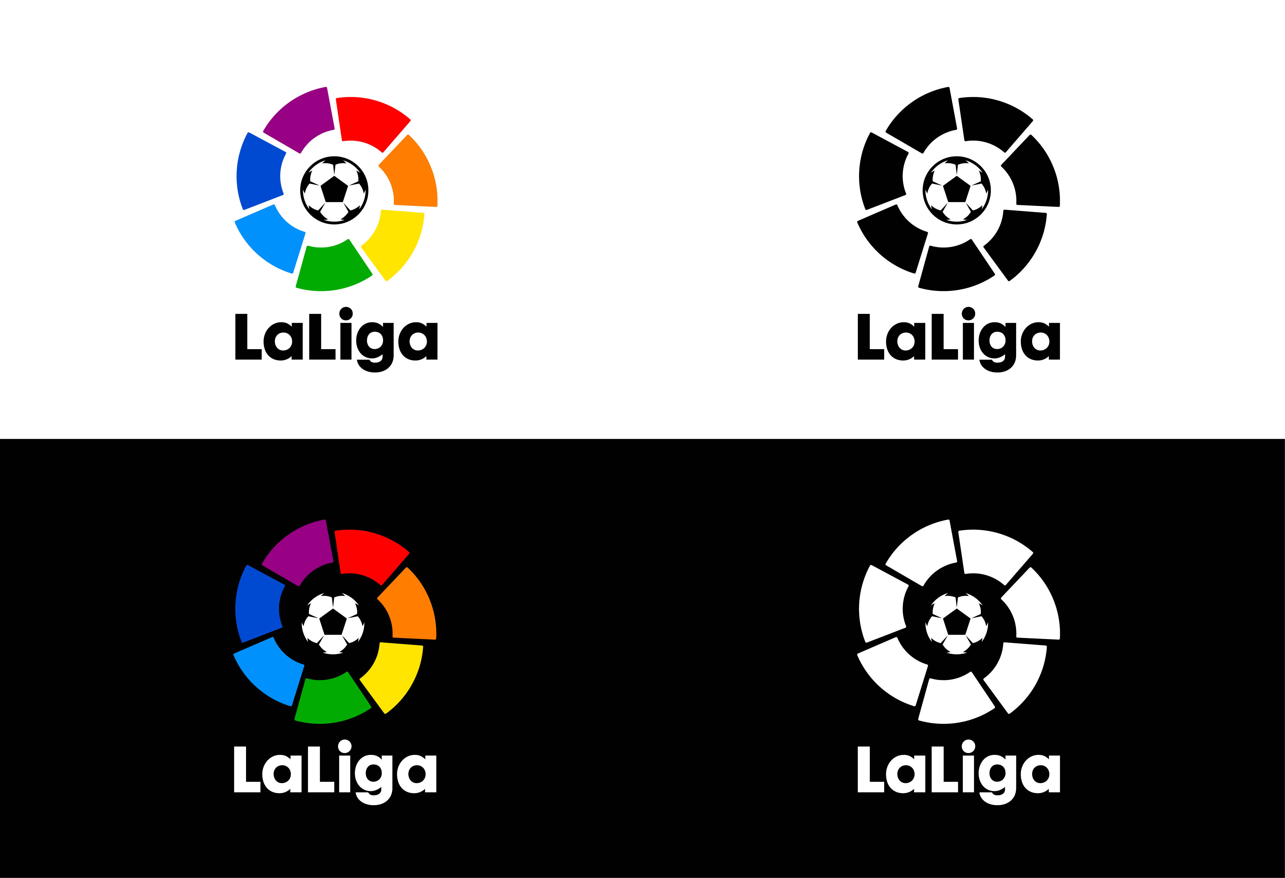
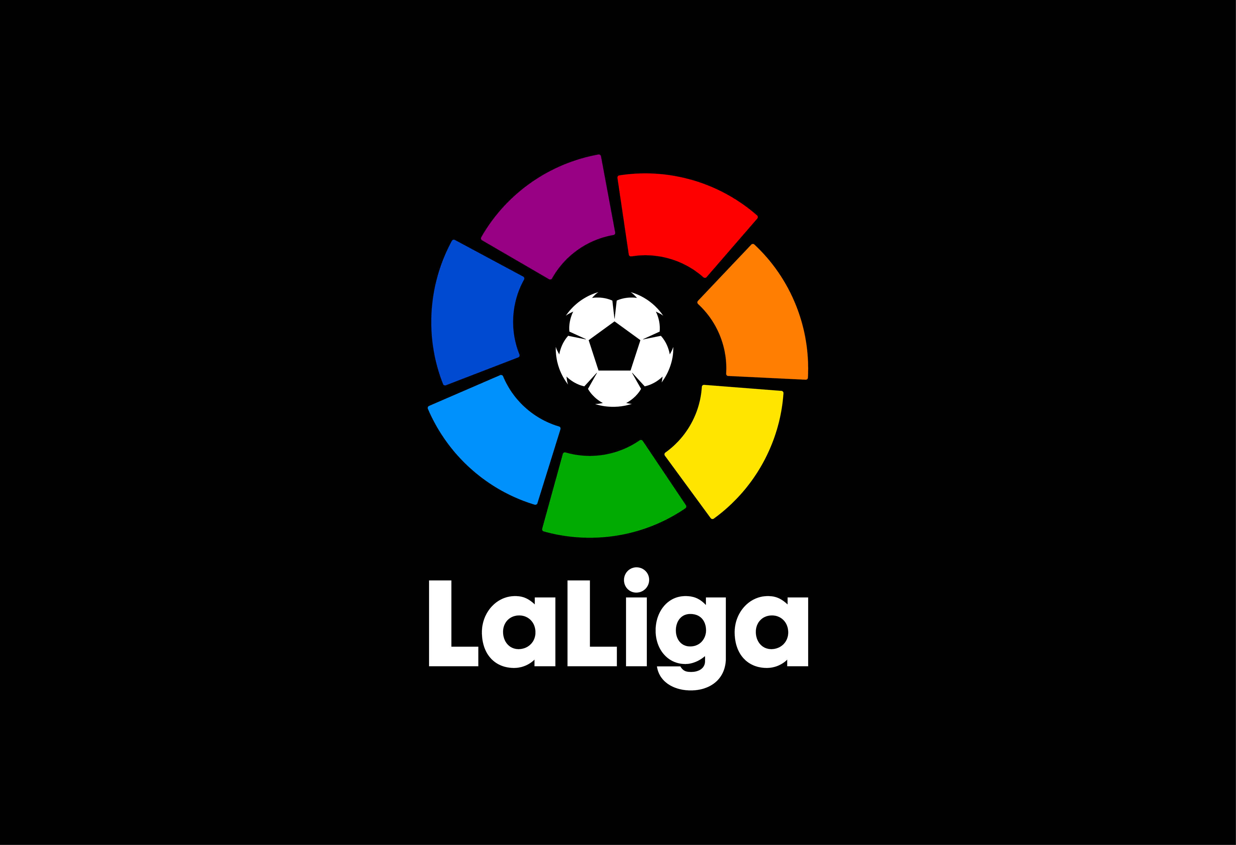
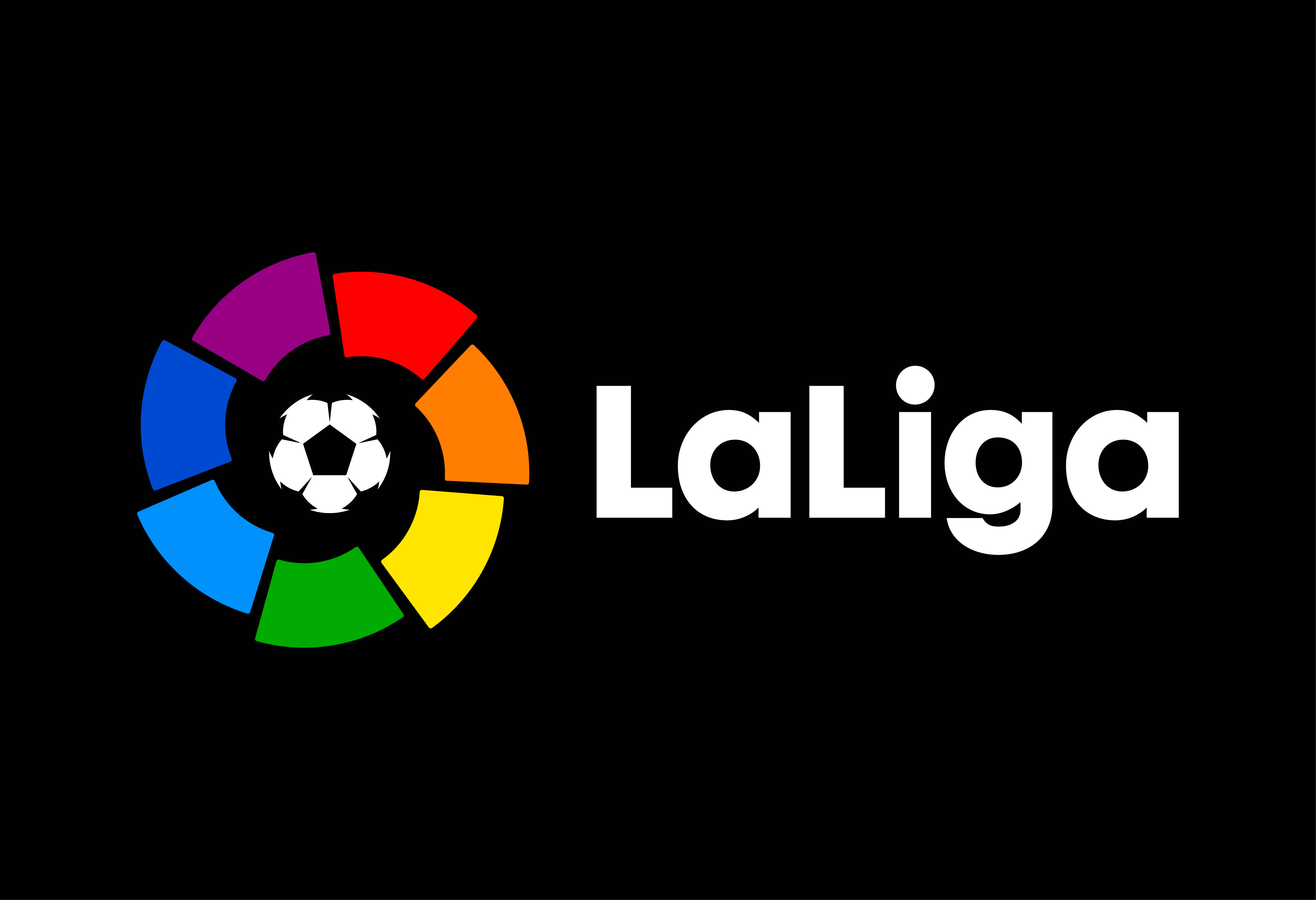
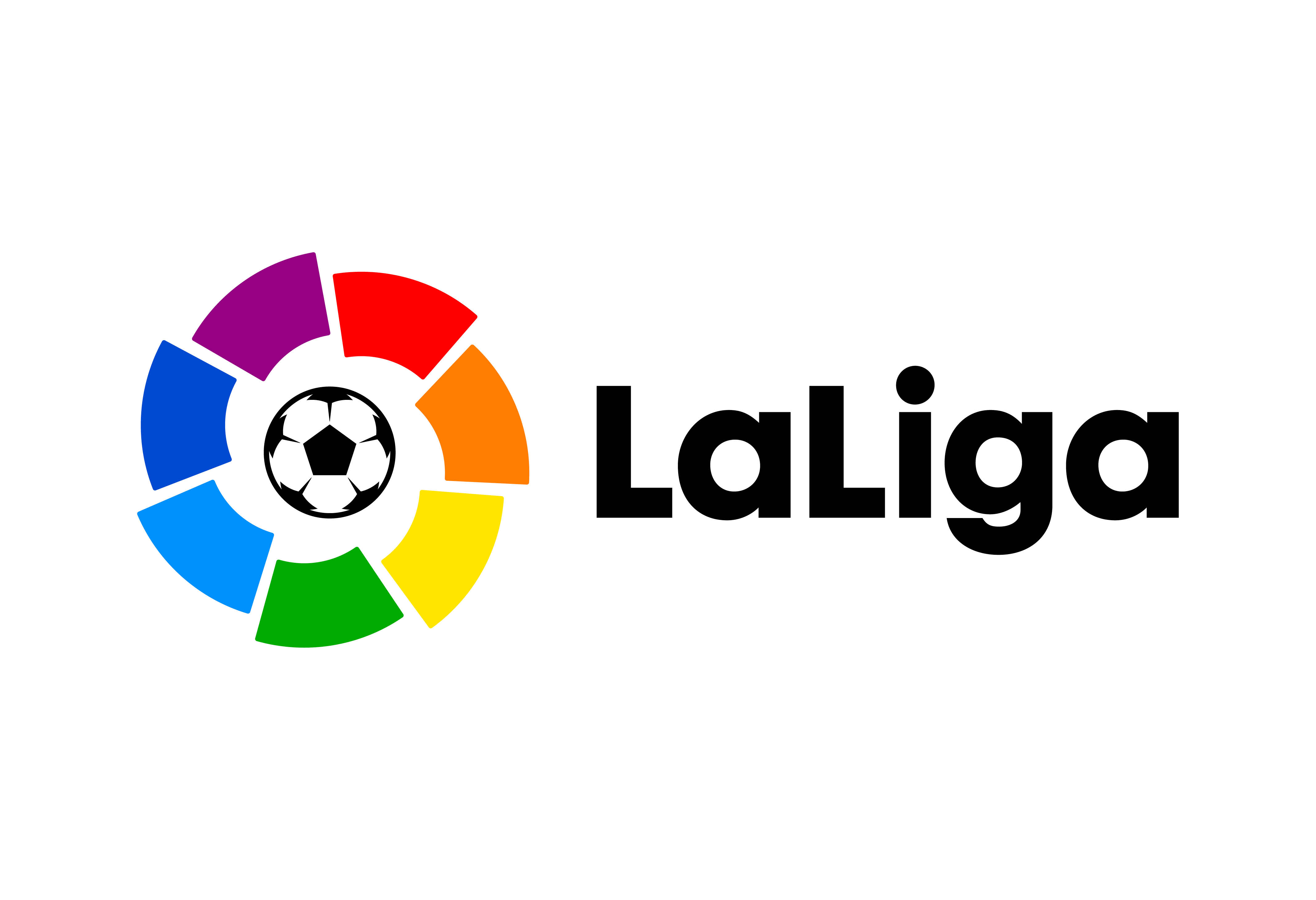
Introducing the new visual identity for LaLiga.
A huge challenge that filled us with excitement to work with the best football league in the world.
The goal was to design a contemporary evolution towards a strong, vibrant and dynamic identity that express the values of unity and team spirit.
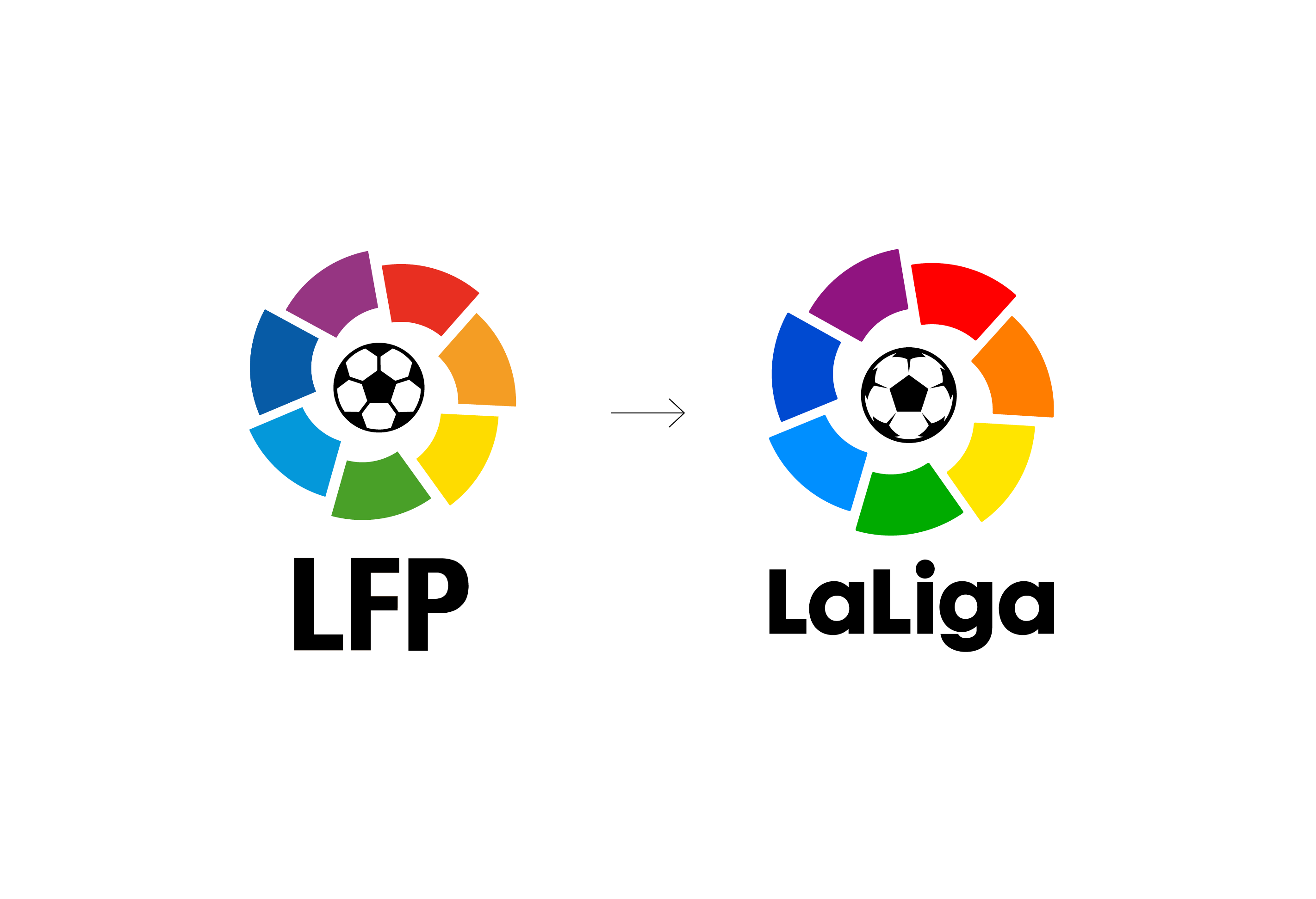
In 2015 the General Assembly approved the change of name from LFP to LaLiga.
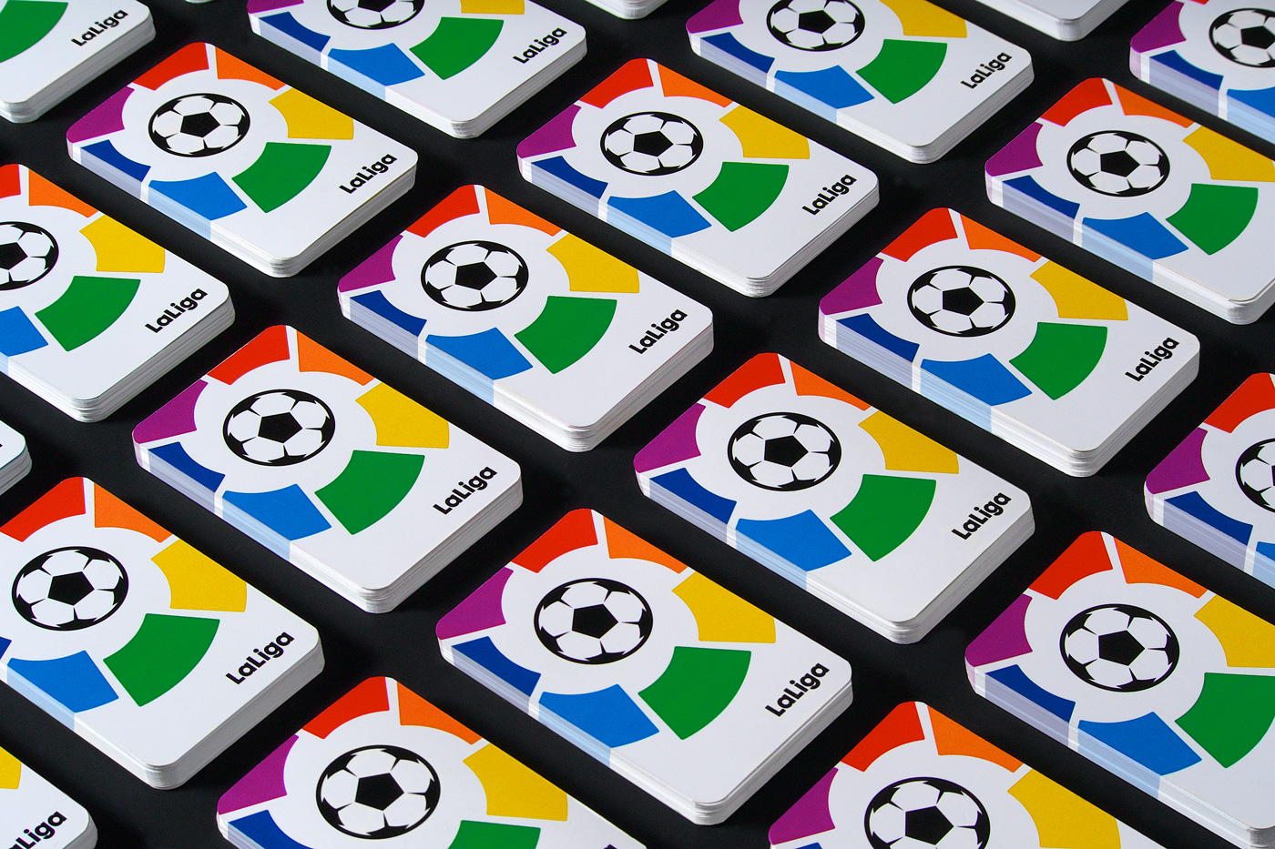
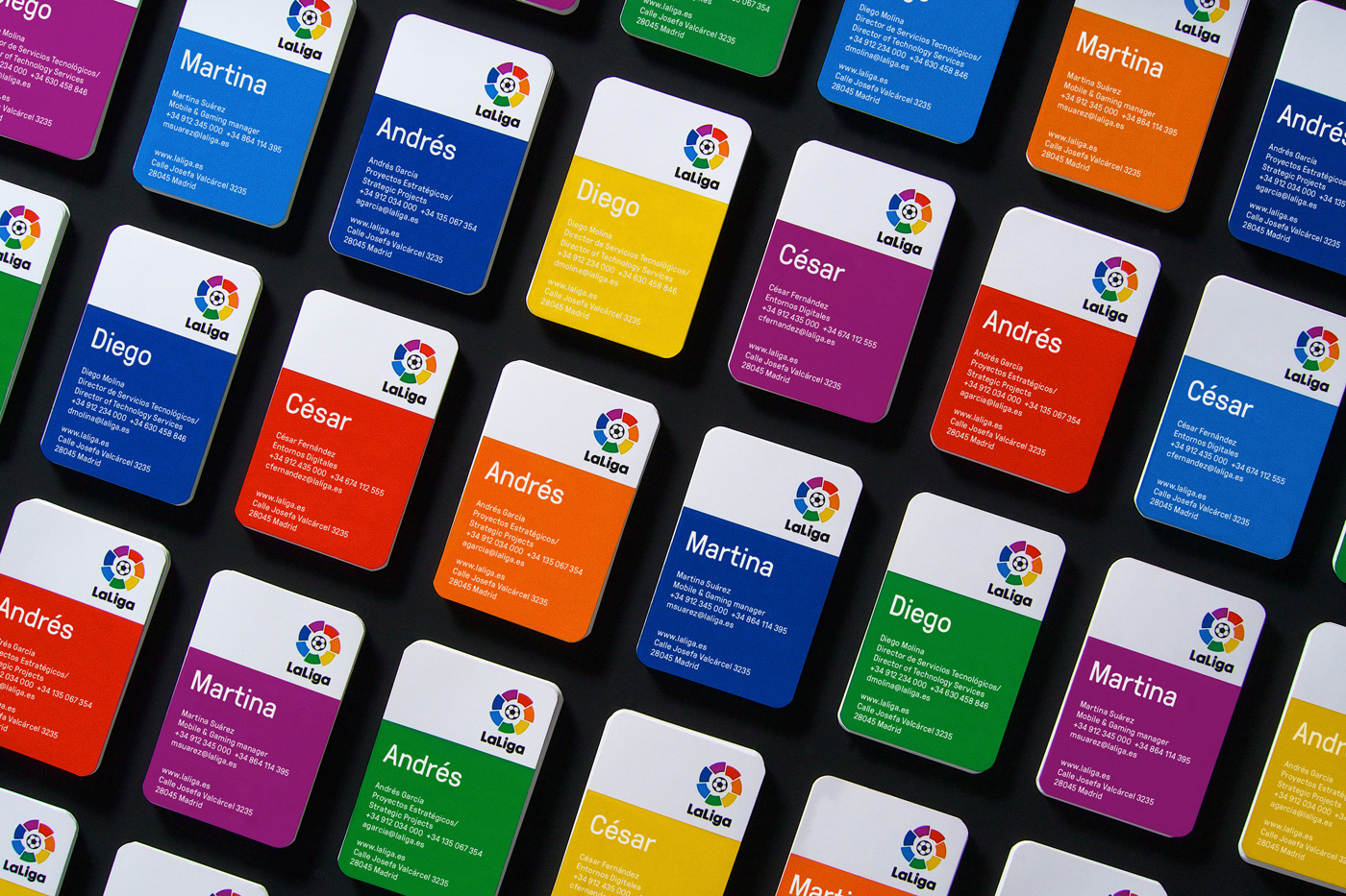
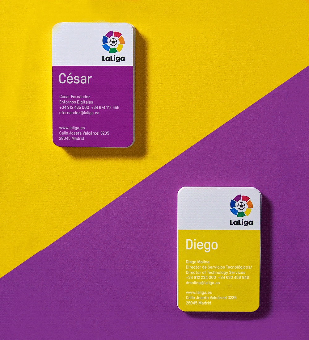
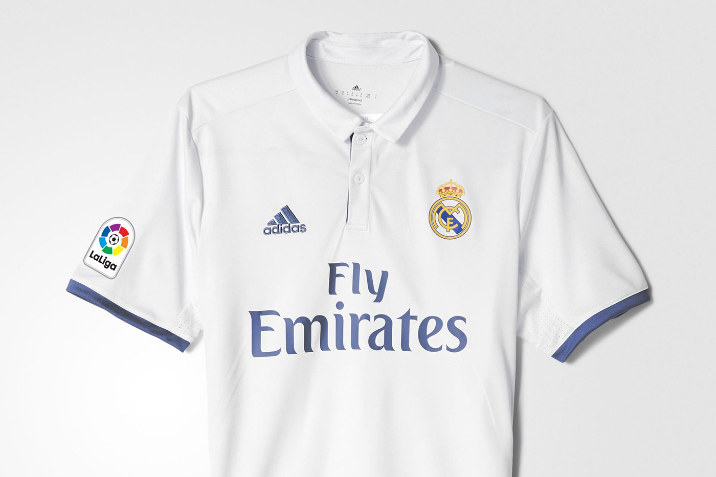
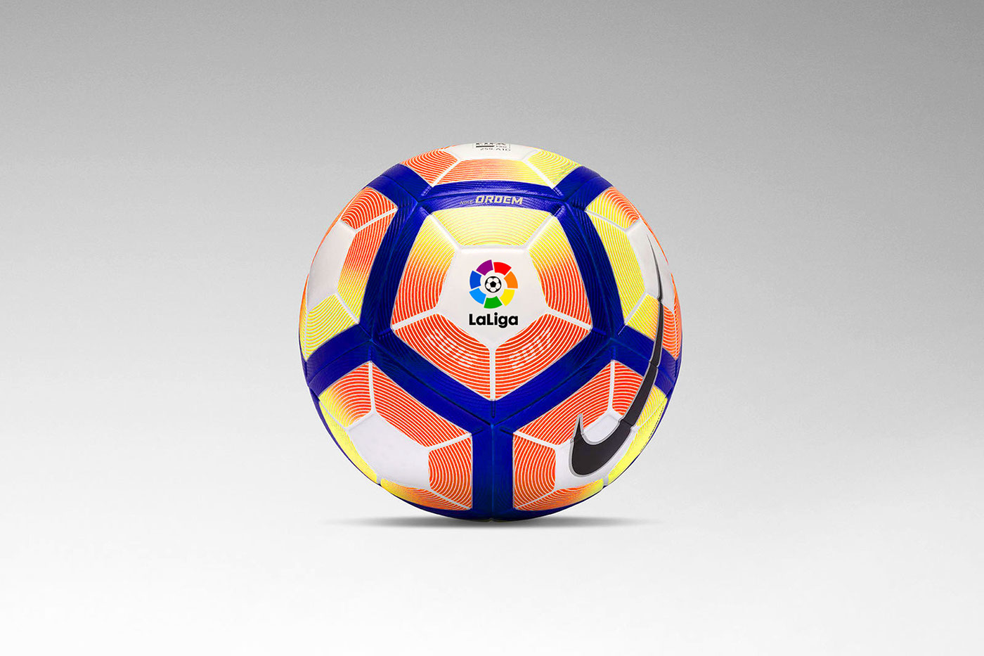
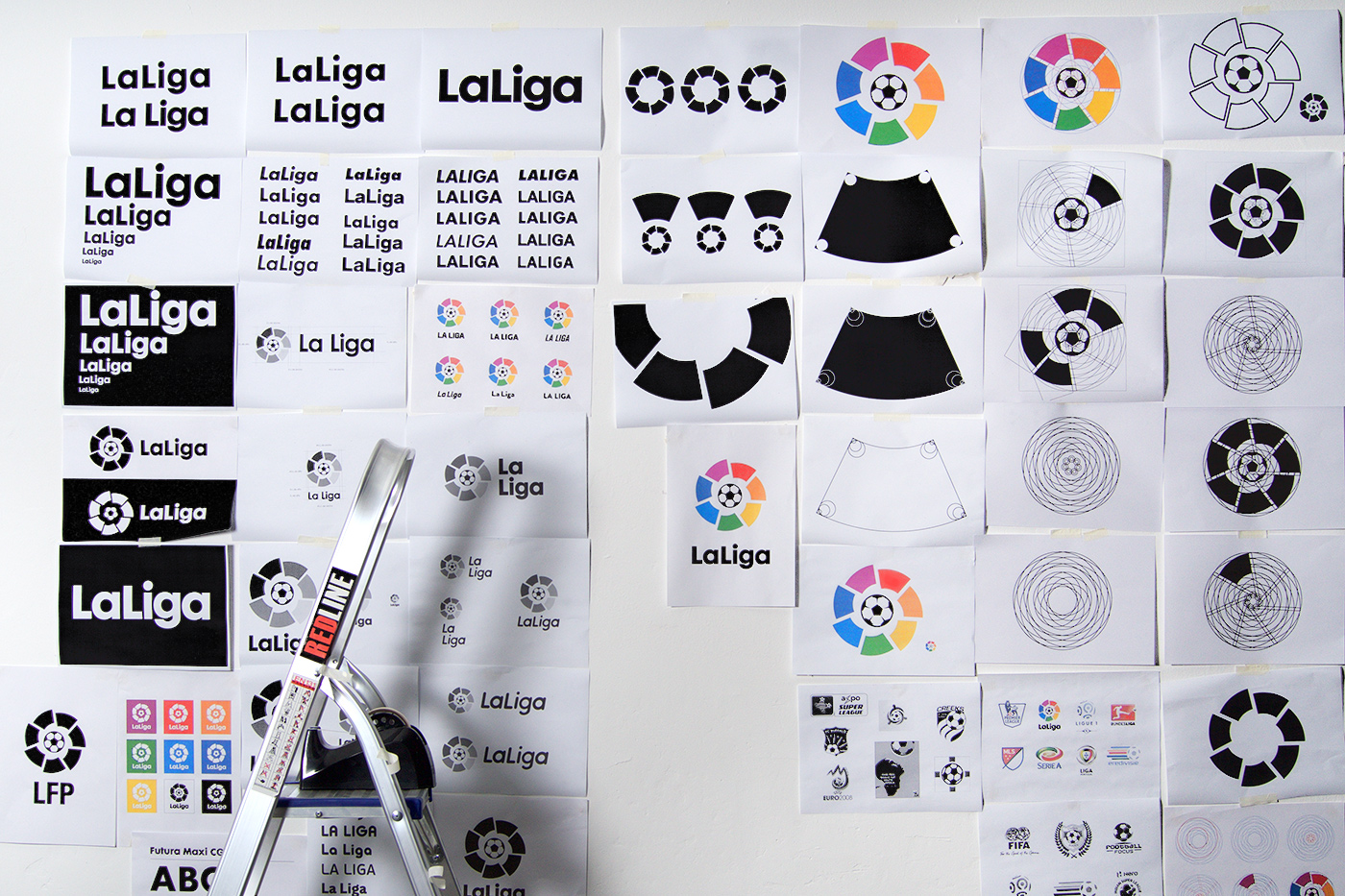
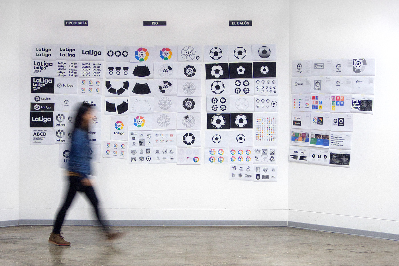
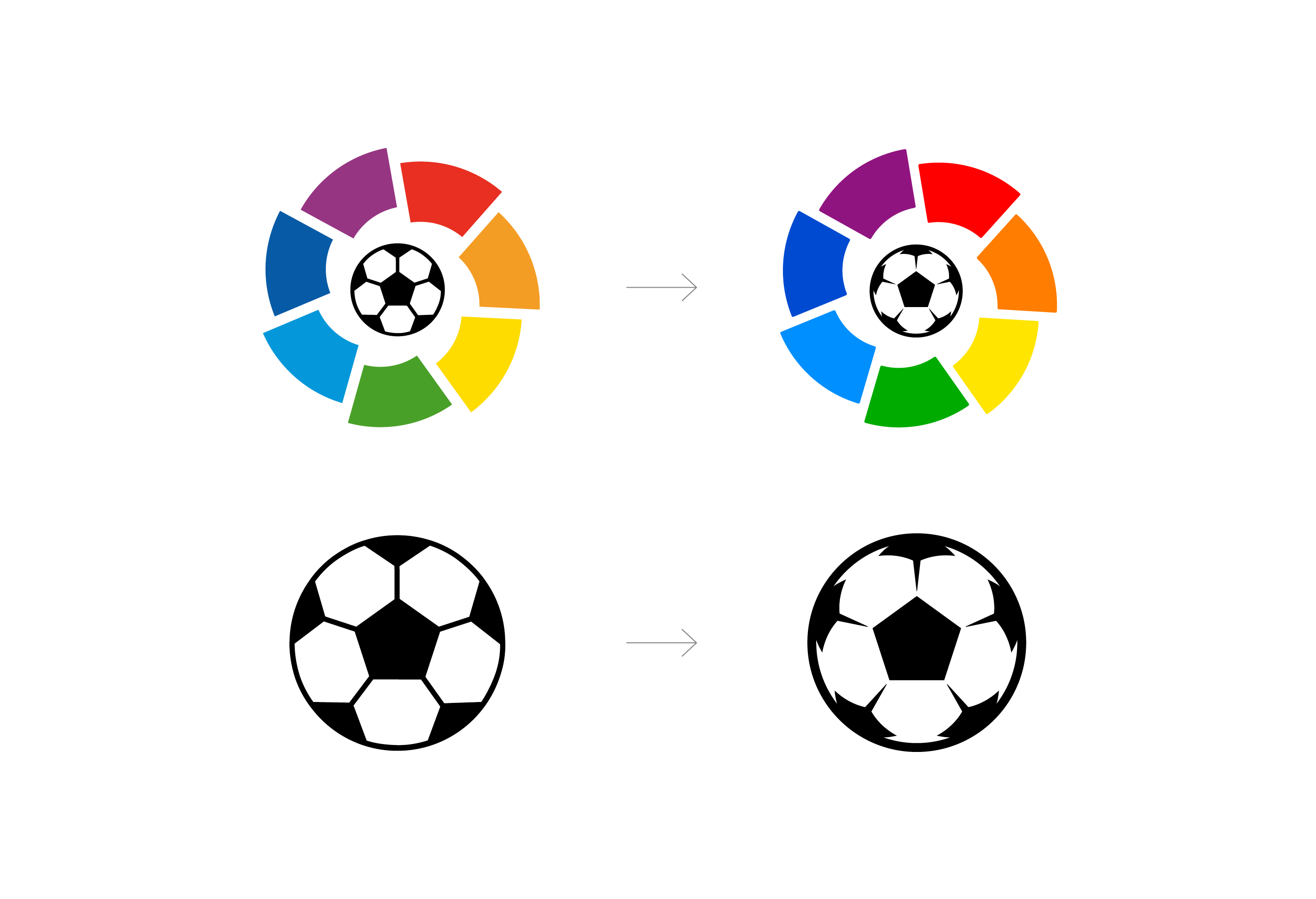
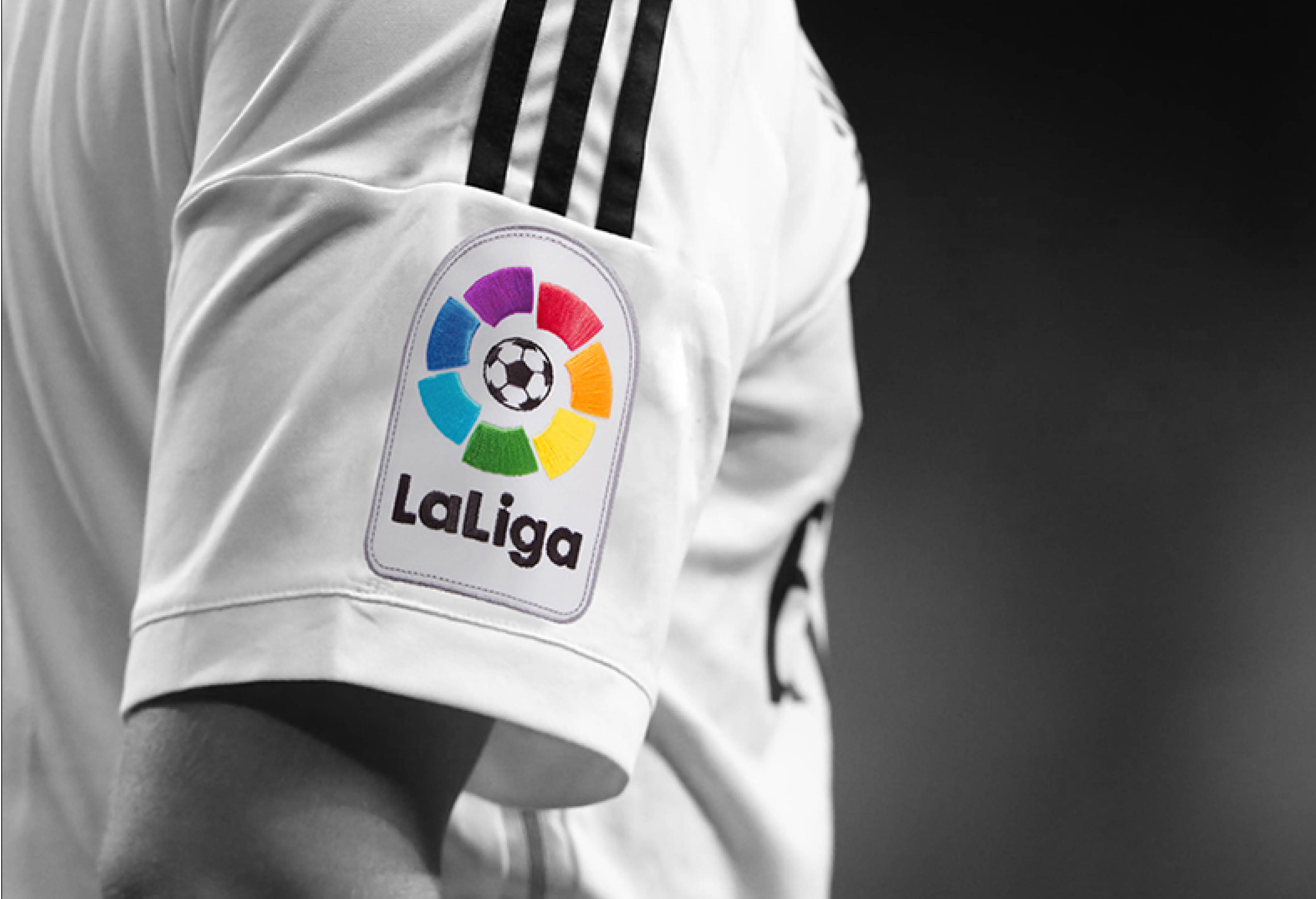
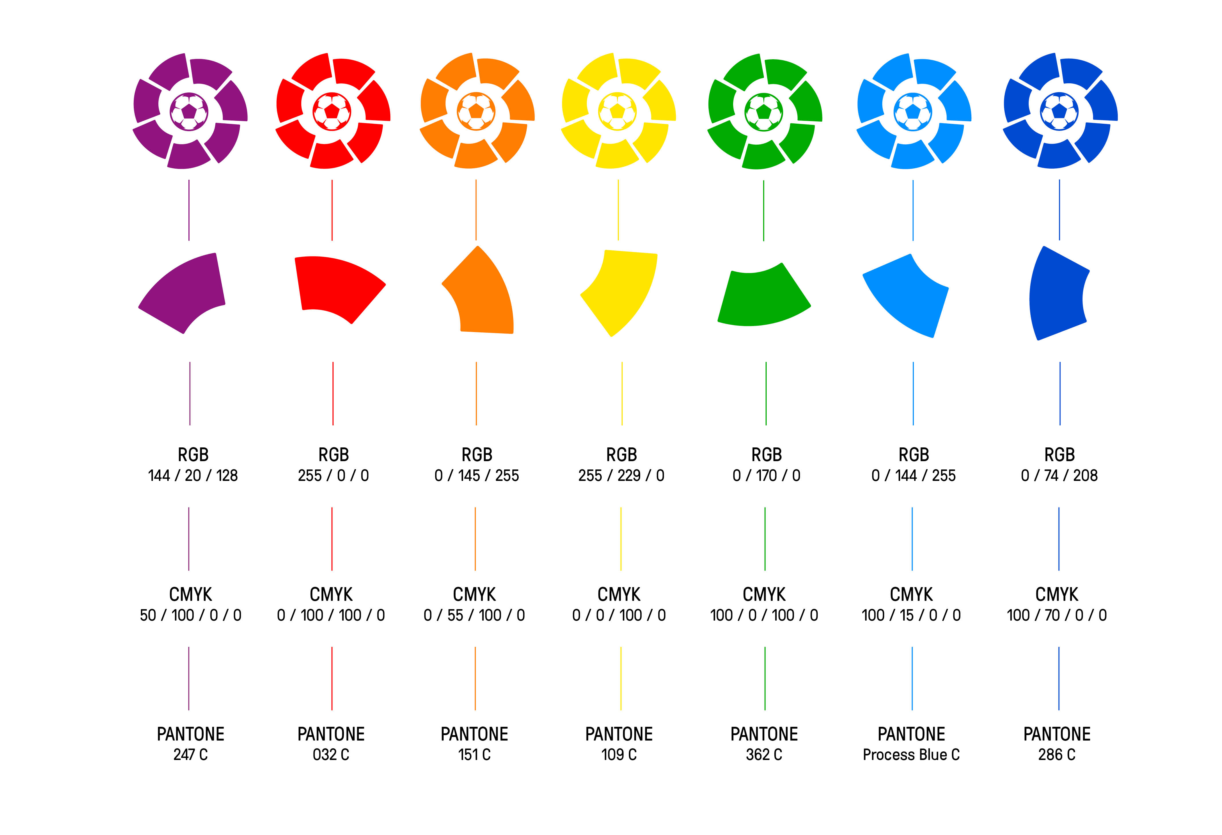
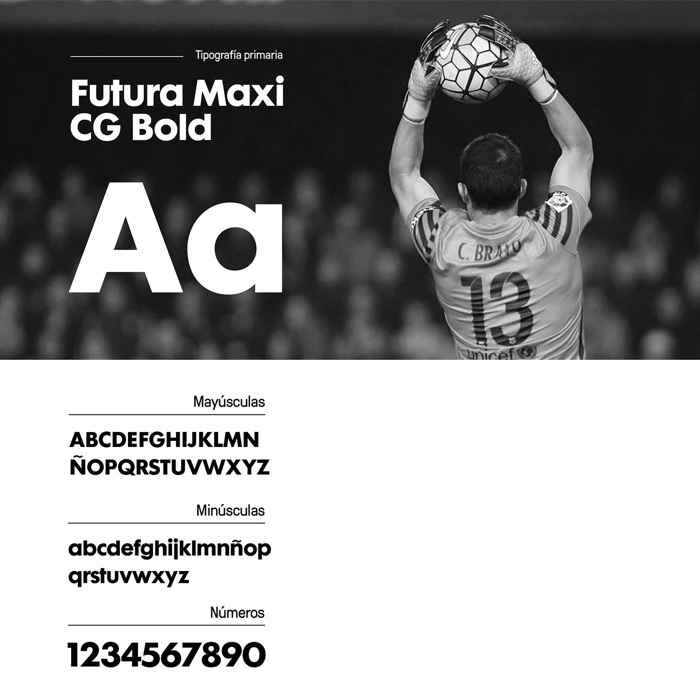
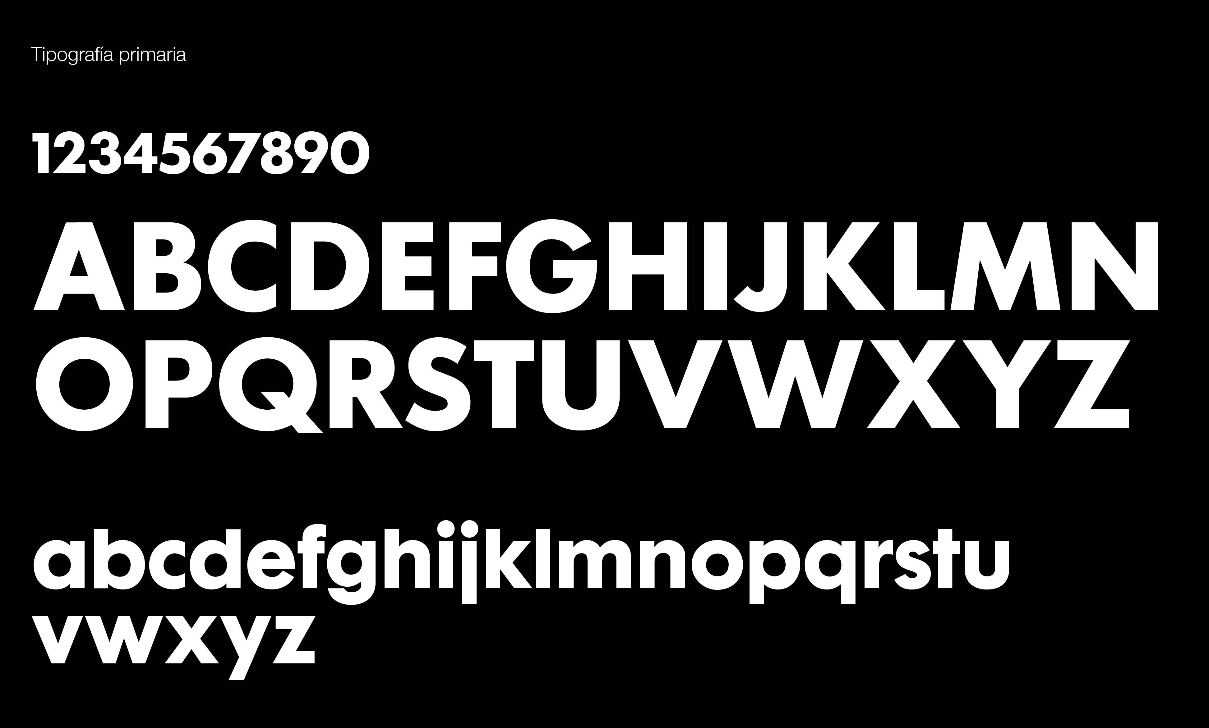
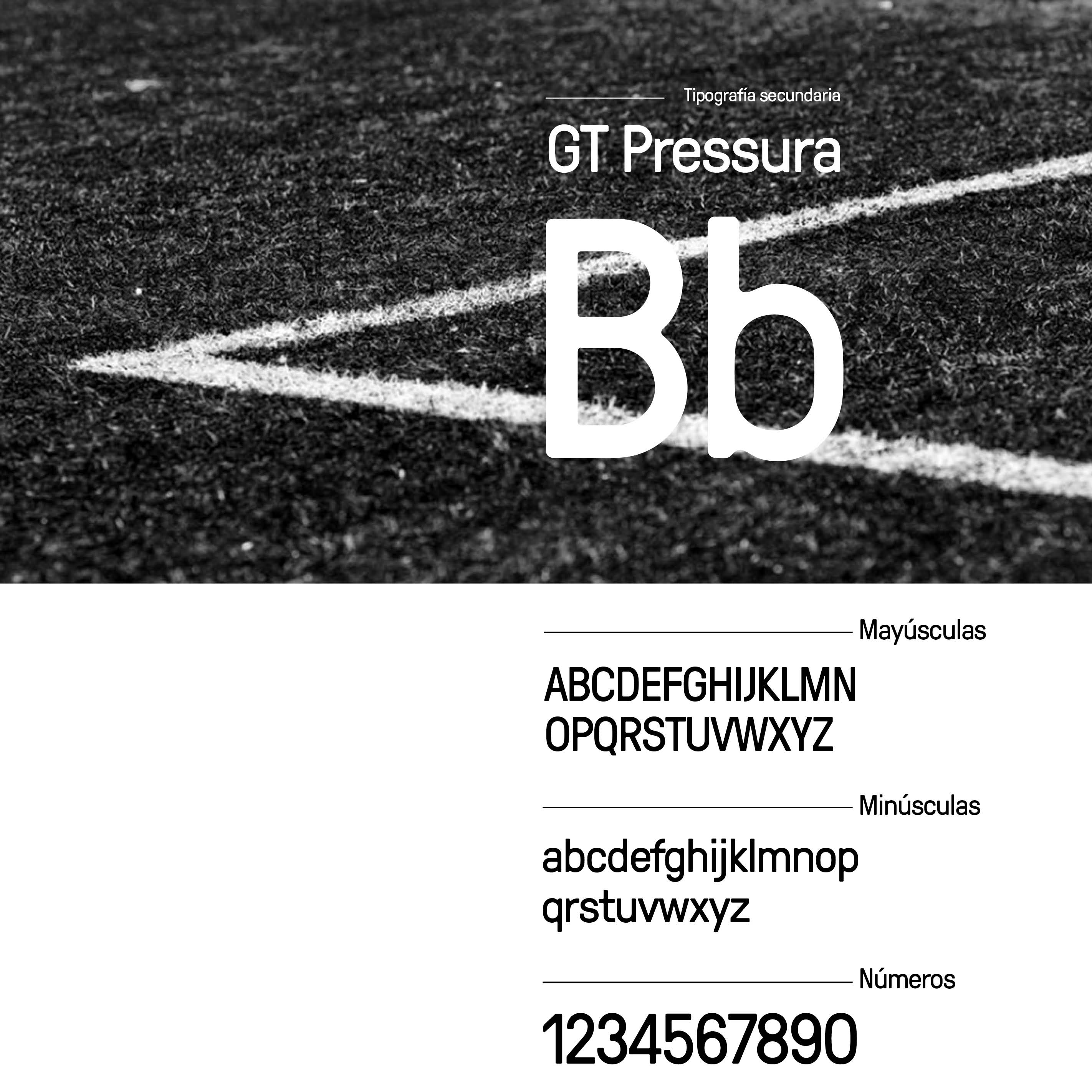
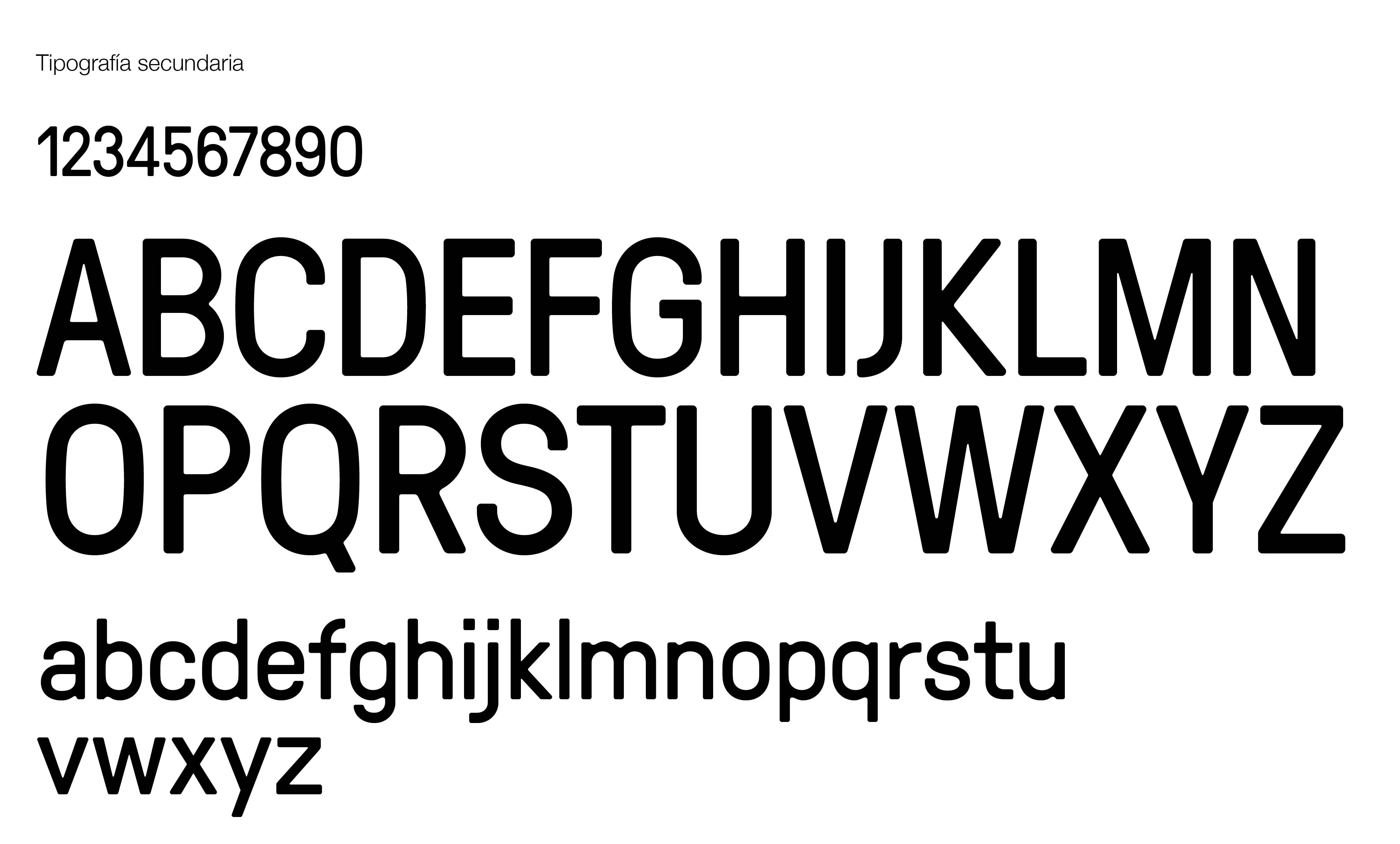
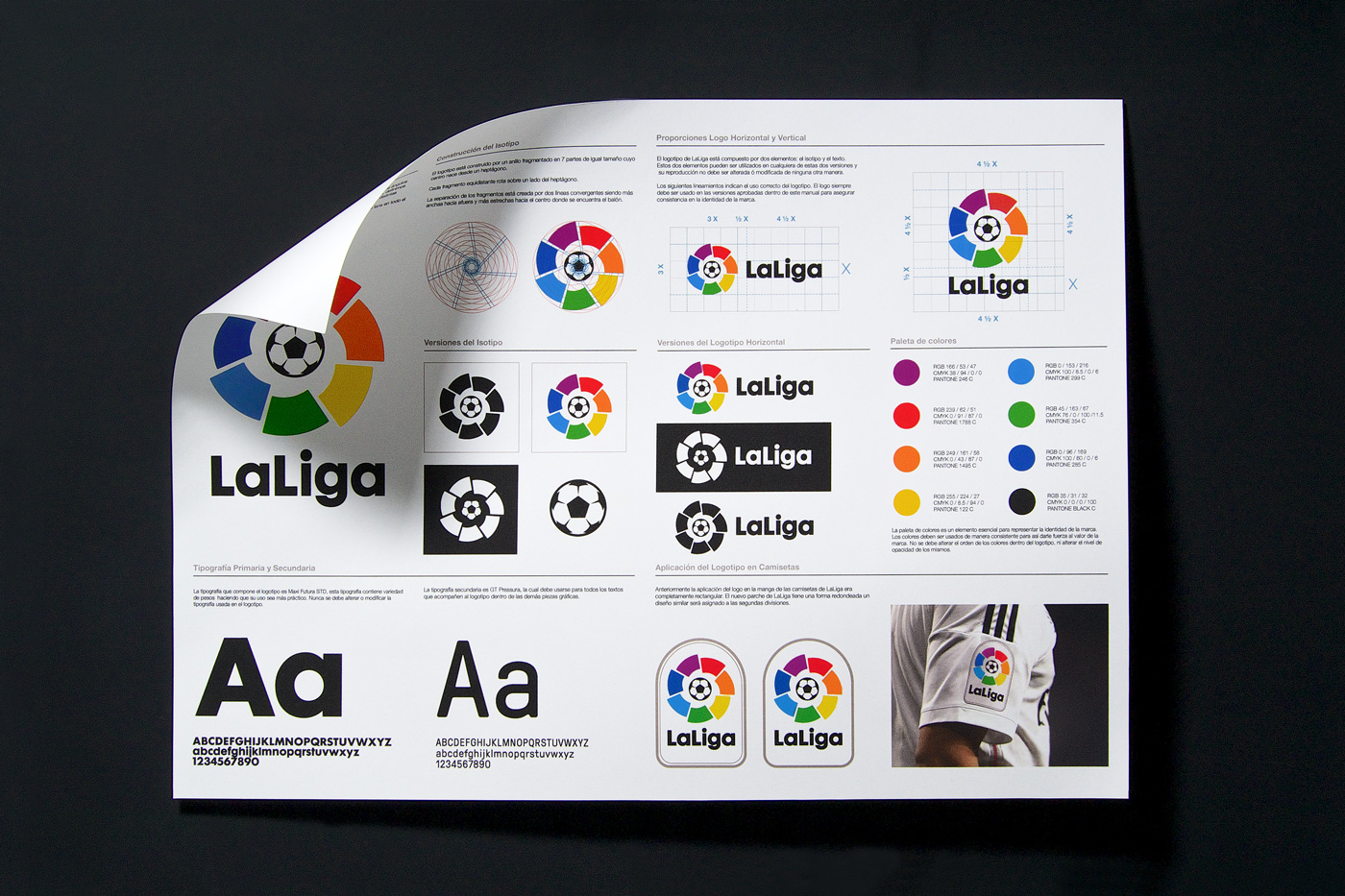
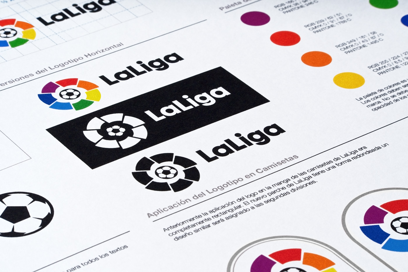
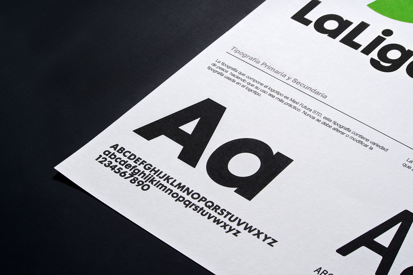
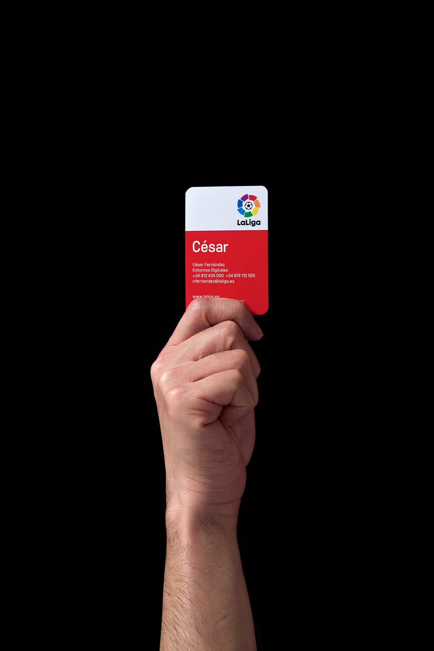
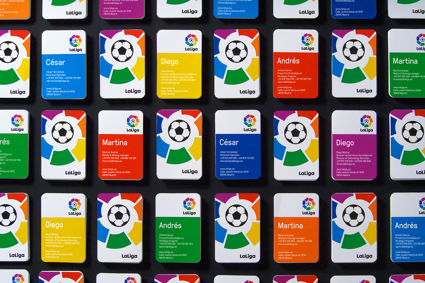
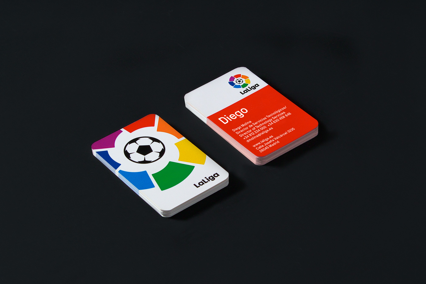
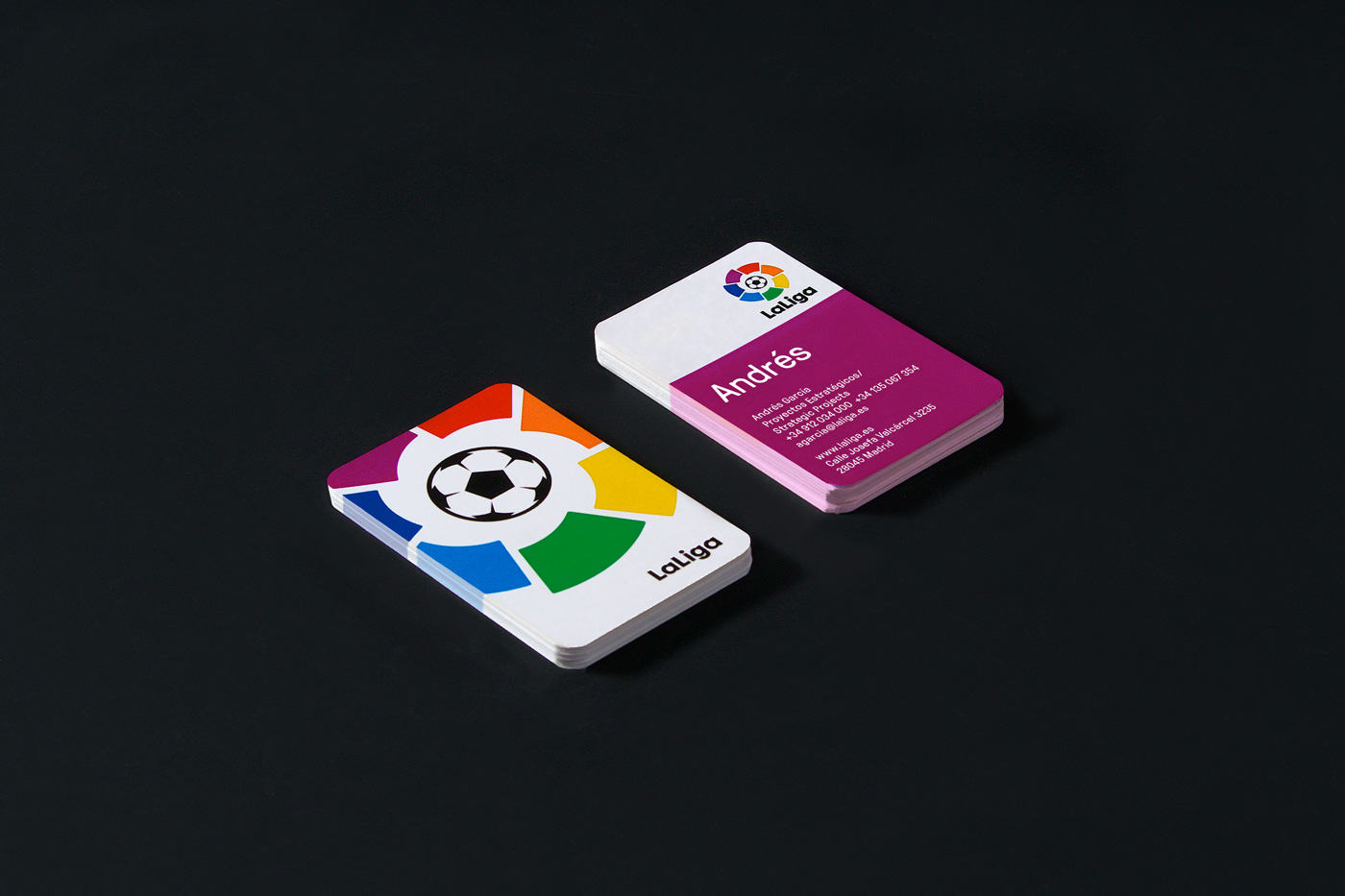
Working in close collaboration with Laliga, we went through a thoughtful and detailed process. We reconstructed the symbol and the ball, accentuating the shapes with rounded angles to give the brand a more friendly, warm and human approach. Also, we define the typefaces and the right proportions of the new system for the various applications of the brand.
A solid and coherent evolution for a brand that is recognised and admired by millions of fans worldwide.
[/todo]
[/todo]