Ficciones Asiáticas
Exhibitions / Graphic Identities
Client description: Ficciones Asiáticas is an exhibition created by Begihandi, a basque cultural association that have created the International Photography festival Getxophoto. In 2009 they presented Ficciones Asiáticas (Asian fictions) an exhibition curated by Alejandro Castellote. On 2011 the exhibition was brought to Lima.
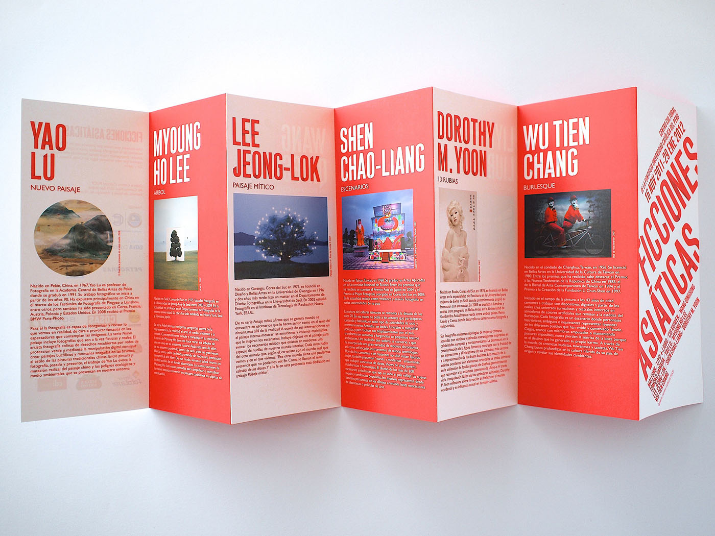
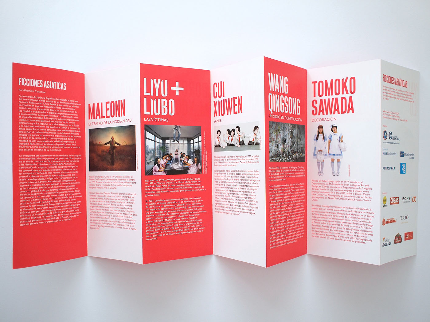
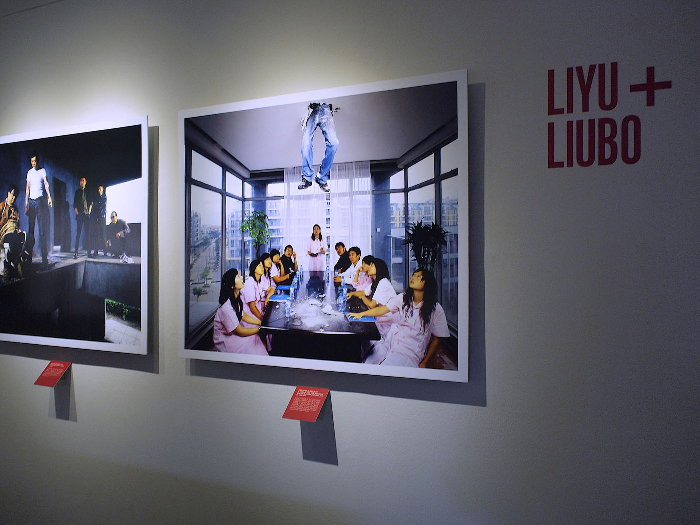
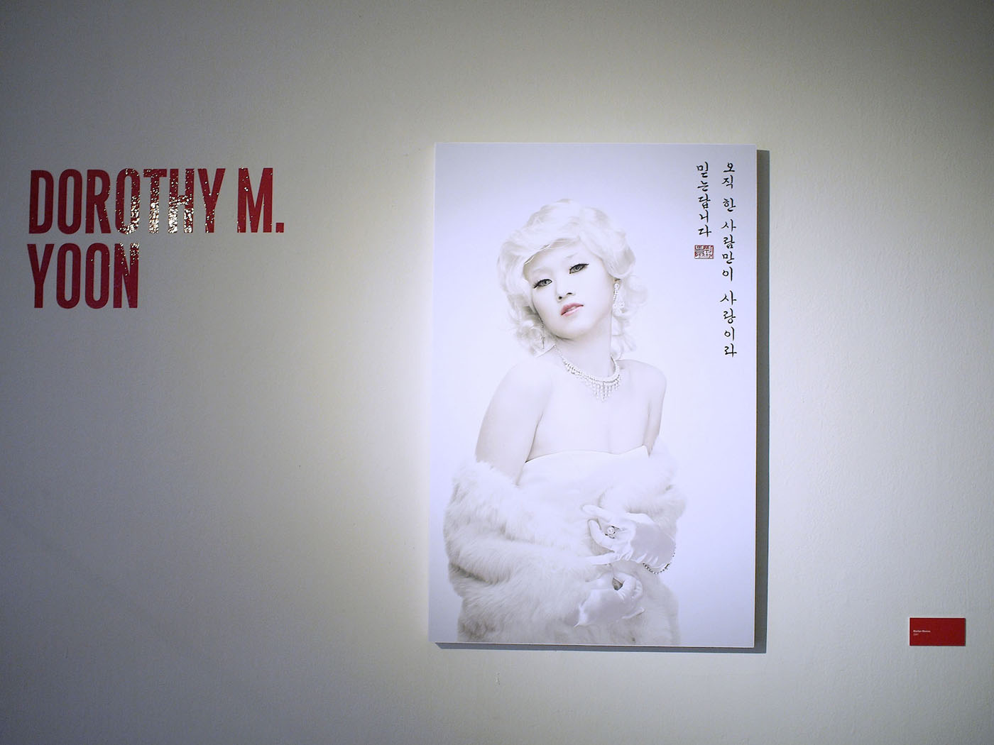
Brief: The brief was create the graphic identity for the exhibition of eleven photographers that brings together for the first time in Peru, whose works illustrate Asian photography creative effervescence that is taking place in China, Japan, Taiwan and South Korea. The challenge was to represent the exhibition avoiding clichés of Asian iconography.
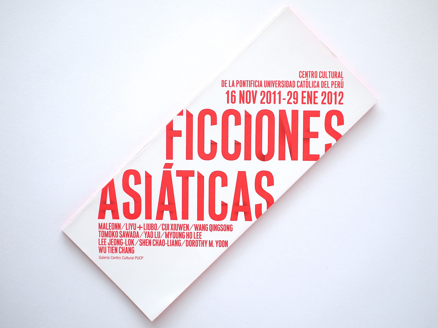
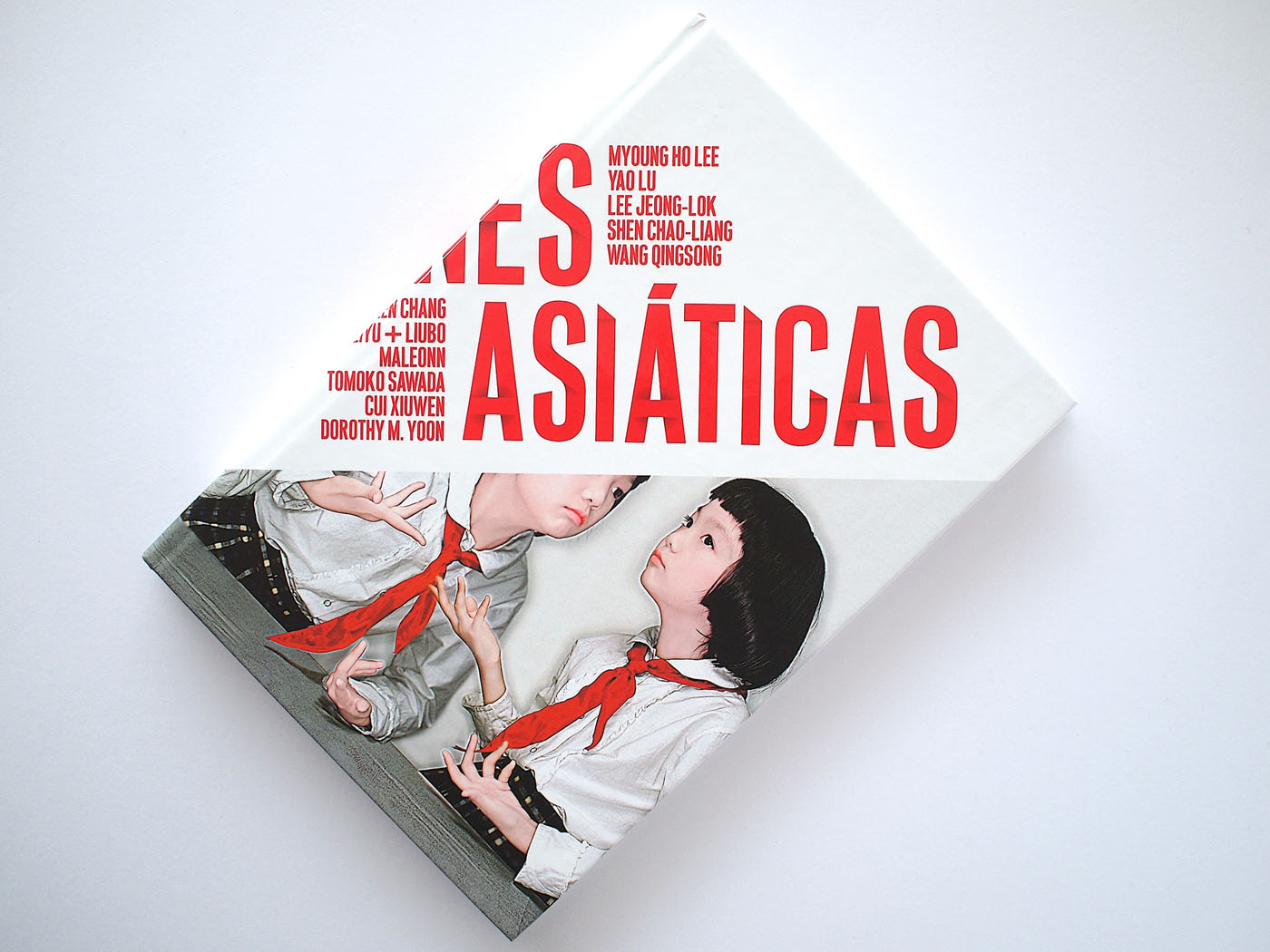
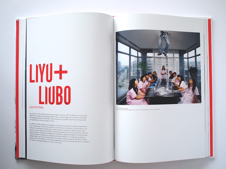
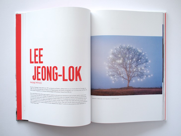
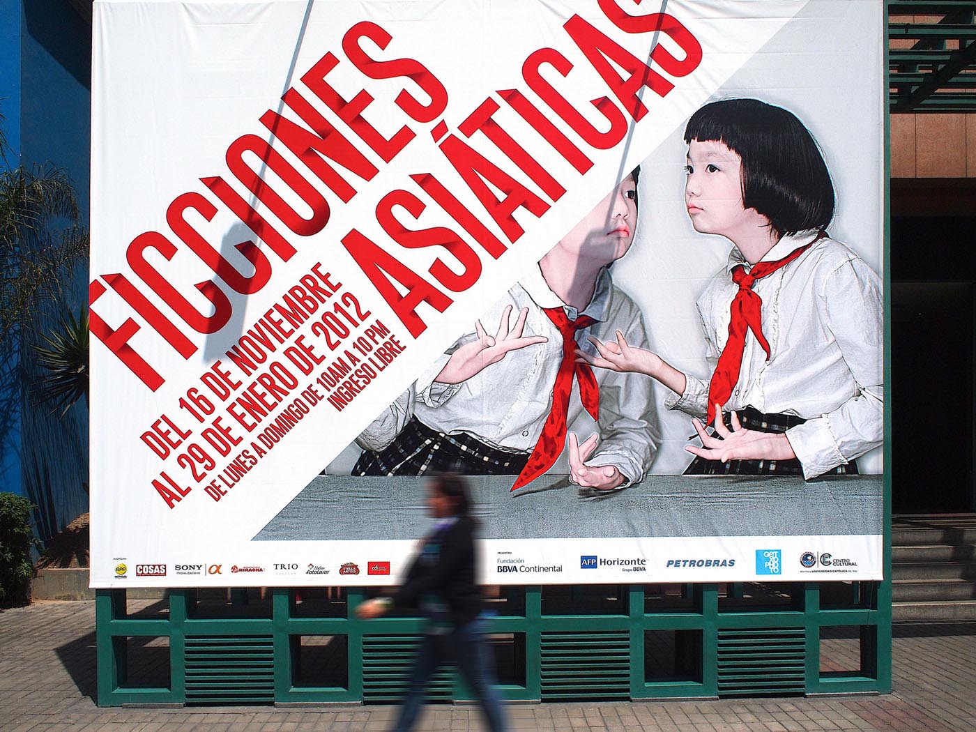
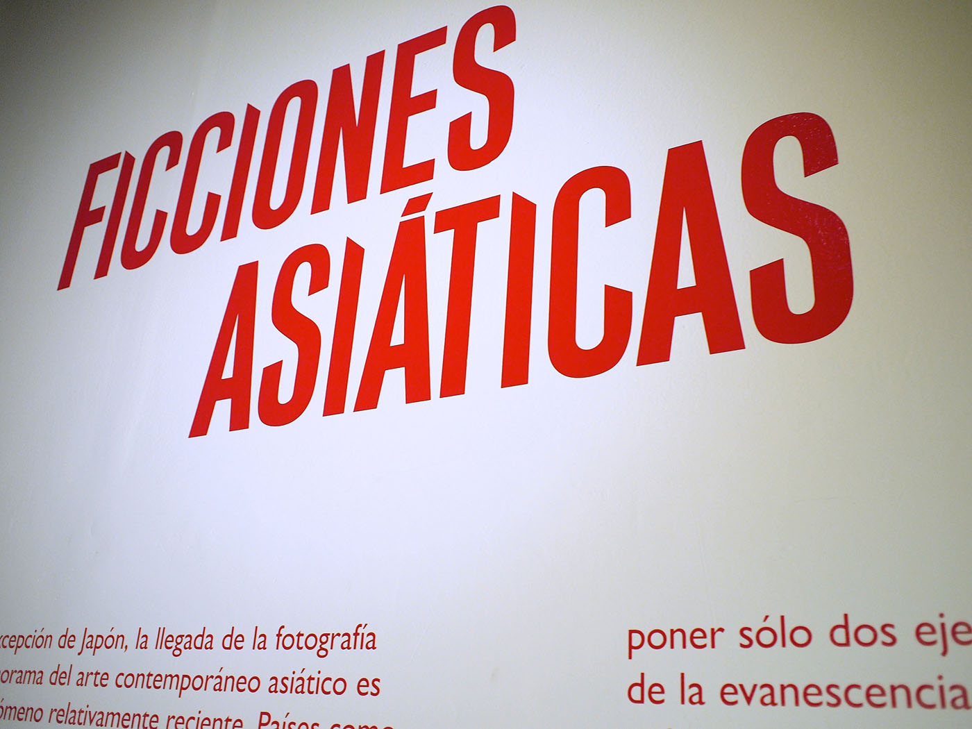
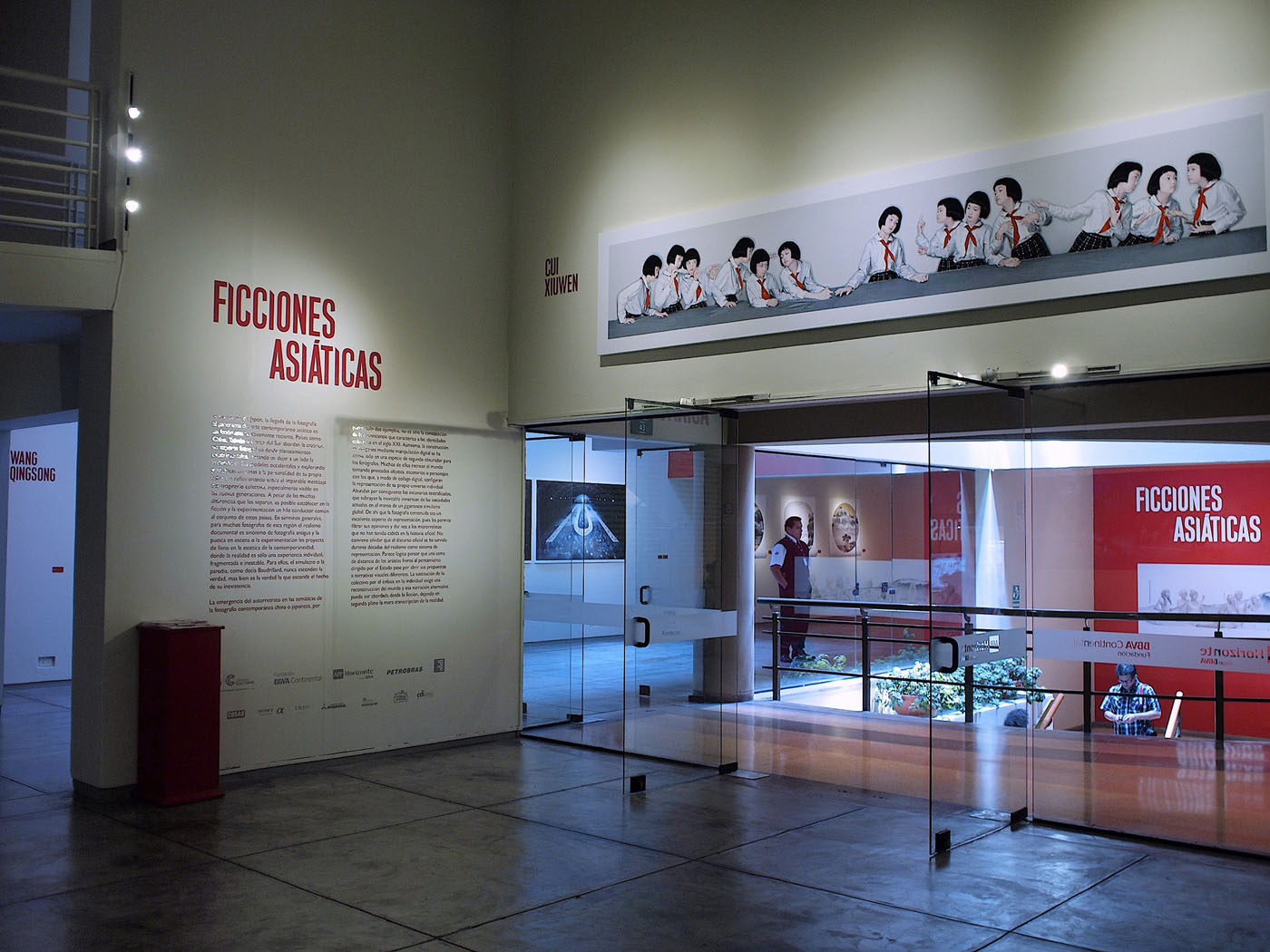
Approach and solution: We started developing the typography for the logo that will be used on the exhibition and all graphic pieces. The red color has a strong presence on Asian culture and using the angles of the typography we add some shadows to give volume to represent high detail on the artists work. We worked the typography as the only graphic element, strong, simple, and minimal.
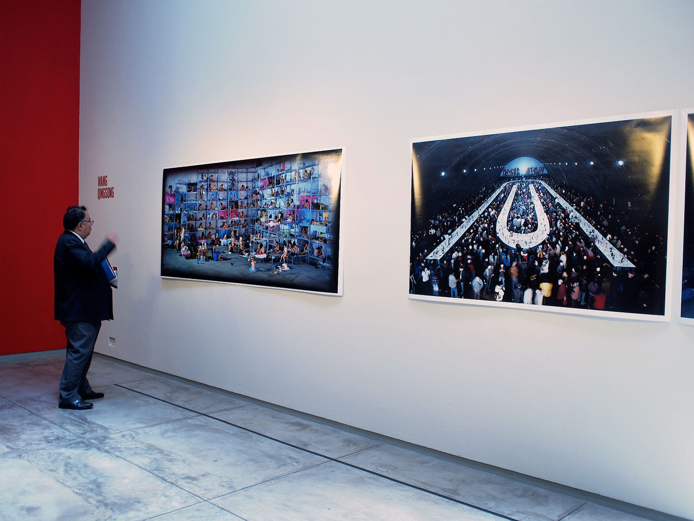
Client Description: Ficciones Asiáticas is an exhibition created by Begihandi, a Basque cultural association that has created the International Photography festival, Getxophoto. In 2009, they presented Ficciones Asiáticas (Asian fictions), an exhibition curated by Alejandro Castellote. In 2011, the exhibition was brought to Lima, Perú.
Brief: We were approached to design the graphic identity for the exhibition of eleven photographers that, for the first time in Perú, brought together eleven great artists whose work illustrate photographs of Asian creative effervescence that is taking place in China, Japan, Taiwan, and South Korea.
Approach and solution: We chose the colour red as it is very present in Asian culture and used angles in the typeface to represent the high detail in the artists’ work that aren’t visible until you look closely.

We started developing the typography for the logo of Ficciones Asiáticas that will be used on the exhibition and all graphic pieces. We chose the colour red as it is very present in Asian culture and used angles in the typeface to represent the high detail in the artists’ work that aren’t visible until you look closely.
The typography was applied as the only graphic element to create a strong, simple, and minimal design.