Client description: GETXOPHOTO is a festival dedicated to photography that takes place in Getxo (Basque Country) and supports the exploration of formats, stands and unconventional exhibition spaces to show the different images.
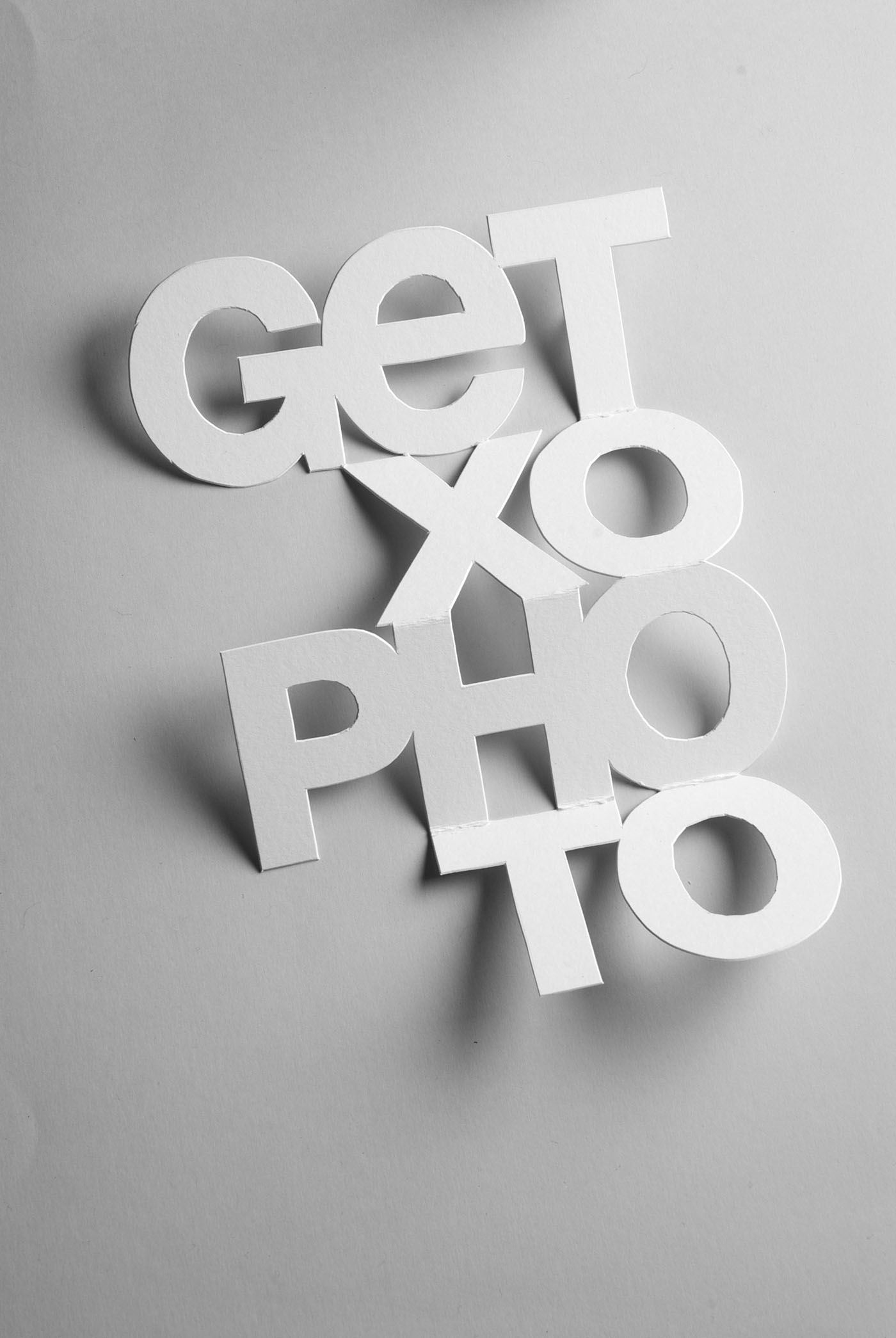
Brief: The festival Getxophoto on the 2010 edition has for theme «In praise of leisure», and it is about the moment dedicated to self-realization. The typography plays a big role on the design, expressing the theme concept. We have to create a typeface that represents the leisure in a bold and simple way so we can apply it to the sign system and communication pieces.
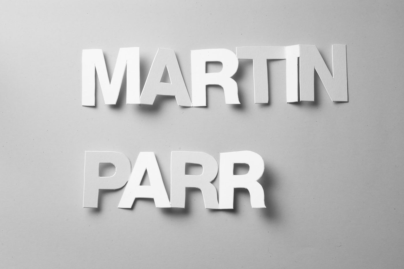
Approach and solution: The typography was created from cut paper and folded like the paper doll chain we used to do as kids. The sign system it is based on the typography we called «Paper Chain Type». The type is based on the Helvetica. And because we have done it on a thick paper It has taken us long time to do the cut and fold, we used our leisure time to finish it.